
Typography design now and then is another art and skill that a designer need to qualified with. On the previous article we already discuss about how we can upgrade our designs using typography; from adjusting how the message feel with the audience to using negative space on a design. Here we will continue sharing some practical tips about how to make letters look better in daily projects like resume, name card, posters and so on.
Learn About Kerning
There are one type of spacing that sometimes forgotten: kerning. Kerning is often misunderstood with tracking, both type of spacing is actually different. Kerning is the spacing between one letter with the other.

Kerning is often becomes the last option to make sure typography in graphic design looks very delicate and professional. Every font is designed with kerning default, but usually the setting is not that ideal for some letter combination. Even for typography design that looks big like headlines, you will want to do visual check to make sure a couple of letter doesn’t look too far or too close; then kerning will be done if it’s needed.
Limit the Number of Typeface & Size/Style
We all like fonts, but you can’t use them too much. Too many different font style in a design will look messy and amateur. As a practical rule, it will be more safe not to use more than three different fonts in a design, eventhough this ‘rule’ can be ignored according to the context. For example, to create an ecclectic and vintage design.

If you want to combine fonts for the first time, a sans serif font is very suitable to choose. Other option is to choose a single letter or in a group that has some size and style choice – with this, typography letters will blend, eventhough they have some variations.
It’s so easy to overuse many forms and style (like bold, italics or capitals). This style can be great to attract attention to text, even the text can look outstanding, to show priority level, or to mimic real life conversation style. Just don’t use everything in one part of the text; it will makes you look forcefully trying to send messages to the audience and it will feel rude for some part of audience. There are fat chance for you to need more than one style and text form.
Don’t do “Type Crime”
A design program can help us to do many amazing things, but it can also be a trap and do a false typography design if we don’t use it carefully. For example, do not stretch a word or letter and force it into a particular space. When you stretch a typography design both horizontally or vertically, it can change letters’ proportion and shape. A better alternative is to scale them proportionally to keep their original shape.

Do not use dumb quotes, a type of quote with straight line, which usually used for quote typography. The curved one, on the opposite, is known as smart quotes or curly quotes. Most word design programs can be adjusted to use smart quotes, or you can simply use the keyboard shortcut.
Do not fake italics. If the font doesn’t have italic style, it’s so easy to use most design programs to add effects so it look italics or pseudo-italics. But this technique usually destroy letters and making them worse. Italics actually has its own design to complete the existing font and always be a better choice.
Check Clashing Colors and Background
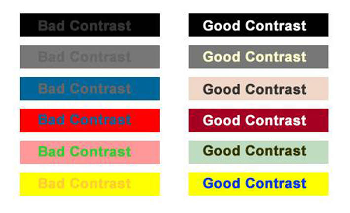
Types of typography don’t stand alone in a design. It interacts with other design elements, usually background. For a word to look good, it’s important for a text to have enough contrast with other design parts. But few things needed to be less contrast:
- Clashing colors: When using a color in typography design, you need to make sure that the color completes other elements in the design, including the background. A too contrast color or even too blended will be difficult to be accepted with eyes and not good for eye sight. You can try to combine text color with the existing color scheme to look more matching.
- Patterned and crowded background: A too crowded background can make a text difficult to read, and of course you don’t want to make the audience confused because the design is unclear. You can try to use pattern as a border or place it in a less distractive in the design.
- Special Effects: Transparent effects, warping and other text treatment might be fun, and also useful in some situations; but it’s also easy to misused. Sometimes we’re trapped in the design process that makes us choose to make some shapes, but in fact it’s not practical. Try to add text effect only when the effect can be understood, not only because you can.
In conclusion, always make sure that the typography types can be seen and read when you try some different creative ways.
Watch and Practice
One way to improve typography in graphic design is by watching how designers use letters type on their works. This is a skill that need practice and development about what’s good and what’s not, so keep finding best typography types -you can find it anywhere, from signs on the road to supermarket aisles.
