As we’ve discussed before, minimalism is a timeless design style. This design style uses the least elements and places each of them strategically to express more with less elements. Generally, minimalism is considered to be easier to be done than other design styles, because it looks far less complicated visually. However, a designer needs to be able to put across the brand’s message with minimum elements.
Neo-minimalism is a further development of conventional minimalism design practices and aims to take it to the next stage. It is stricter than conventional minimalism design style when it comes to reducing more elements and making use of more negative space; making the design still look appealing while using matching typography and colors without losing it’s brand representativeness.
In neo-minimalism design style, a designer will be challenged to communicate effectively through the ‘less is more’ philosophy. The trick is to find a way to be the most creative with least elements.
Use strong images
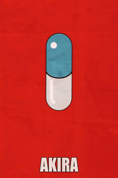
Or no image at all. Strong image as a focal point will have a direct impact in achieving neo-minimalist design. This will also help the audience express what they actually feel at the first time they look at the image. A strong image also can help forming connections between the brand product/service with the audience.
Use creative fonts with caution
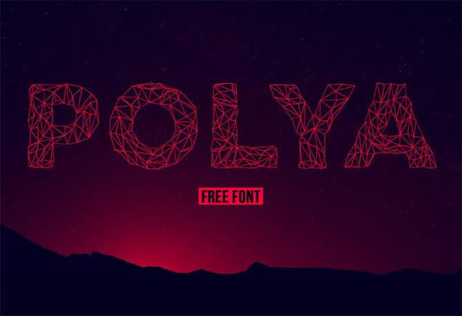
When a designer using no image and choose creative fonts instead, one still need to be cautious with this element. Remember, neo-minimalism uses fewer elements as possible; while using fonts (especially the creative, customized ones) is closely related with a brand’s legibility. If the font is perceived too creative, the brand’s legibility can be misunderstood. So it’s a designer’s task to find the right balance between creative and legible so that the design style and the conveyed message is still in line.
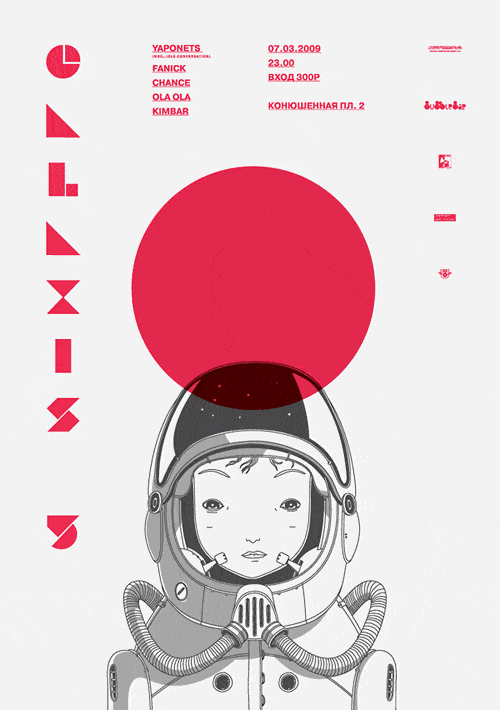
Use simple colors
Try using simple colors that complement each other. Usually a designer will choose two to three colors in minimalism design style. In neo-minimalism, using only two colors already create more interest and contrasting effect. By using limited colors a designer will emphasize the impact of the chosen color on the overall design, and helps create a sense of urgency of what the color represents.
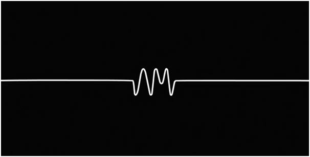
Using flat design

Although 3D designs are also widely used at the moment, in neo-minimalism, flat and simpler designs are much preferred. Applying 2D images and visuals instead of detailed 3D elements will help the design to feel simpler and more welcoming to the audience.
Maintain a (very good) balance
Making sure that the entire composition is in balance, is the main key in neo-minimalism design. Since there are lesser elements on the canvas, balancing can be more difficult because we can’t always counter each element with another because of the different weights among the elements. Make use of negative space in a way so the design will look overall pleasing can be very helpful in balancing a neo-minimalism design.
Neo-minimalism is a great design style for people who don’t want to waste time. This new target audience are allowed to interpret the design in a way they seem best, and they might have a certain sense of appreciation for this philosophy. As a designer, we need to understand how our design will interact with different elements, and how the design can be seen and actually useful in real life.

