
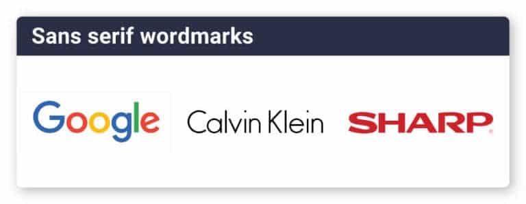
Wordmark is a type of logo that often used, which directly using the brand name. No symbol, mascots or badges in the logo. Some brands who choose to this text-based logo are Coca-Cola, IKEA, Google, Dior and Forbes. But does this means that wordmark logo only suitable for big and luxurious companies? We will discuss the difference between wordmark and lettermark, the examples of using wordmark logo, its main components and its advantages.
The difference between wordmark and lettermark logo
Wordmark and lettermark logo is actually similar, in terms that it uses text as the design base or also known as logotype in design world. What actually differs between wordmark and lettermark logo is that wordmark includes the complete name of a brand, meanwhile lettermark only uses its initial. Canon, Nikon, eBay and Google are some examples of wordmark logo design; while CNN, HP and McDonalds are examples of lettermark logos.

Your brand name will be a crucial part of the design process. If your brand name is short enough to be mentioned in the logo design without making it too crowded or compact, don’t hesitate to use wordmark logo. But if your brand company name is long enough, lettermark logo design can be a good choice.
Wordmark Logos for Small Business
Logo that displays brand or company name is quite popular in start up business and small business. With a particularly good reason, wordmark logo which using technique that connects business name with logo design tends to make the brand easier to be known and memorized by the audience thus help a lot with branding. Obviously you dont’ want your logo to be boring and forgettable.
Wordmark logo is very suitable especially if your brand has a unique name. But if your brand name is quite generic, an iconic logo or monogram will be more effectively help representing brand essentials. Last but not least, wordmark is a right choice for a company with limited budget. Wordmark logo usually is less expensive because the design process is easier. But wordmark logo still need to be carefully designed on its detail, typography choice and design style.
Main components of wordmark logos
A well-designed wordmark is the ideal solution for some businesses. You need to understand main elements that form a wordmark logo to create a simple yet attractive logo design. Here are the components.
Font and typography
When choosing font and typography for your wordmark logo, choose them based on your brand characteristic. Serif fonts, for example, can represents a more traditional and luxurious look in a logo. But if your brand focus is on innovation, a more modern Sans serif type might be a better choice.
Meanwhile for font choice, consider font thickness and style (Italic, Roman). A thick font will deliver a strong character in a logo, meanwhile a light or Italic font will be better in representing an elegant brand. Because of the simplicity of wordmark logos, typography and spacing are extra important.
Kerning

Wordmark logo is a text-based logo, thus logo readability is very important and in this part, kerning is needed. Kerning is a space between letters. One good tip is that if your brand has more than one word, give a good space between the words to keep logo’s readability. As an alternative, you can split the texts into rows. This will give a cleaner look in wordmark logo.
Color choice
For a wordmark logo to be more alive, color choice will become very powerful. The right color choice also gives certain interest and stronger character in a logo. Your logo with the right color choice can actually outstand hundreds other logos with similar font and typeface.
You can use more than one color to emphasize particular letter or word, such as in HubSpot, eBay and Subway logos. If you want to be more playful, you can add background or shaped colors such as in Marvel logo. Referring to color psychology, each color can give out different emotional effect.
Character
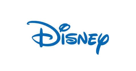
Adding unique elements can help wordmark logo design to be more outstanding than the others. For example, the modification of ‘D’ letter in Disney logo. It makes the logo so easy to remember and recognized, so the audience already know in mind that it’s a Disney logo without saying it out loud.
The addition of this unique element needs a strong meaning and philosophy that represents brand identity and has to be capable to depict what the company offers. For example, the additional character in Vans’ ‘V’ letter make it looks like a skate ramp, and this shows that Vans target audience are mainly skateboarders.

Shape
You can highlight part of words that deemed relevants by using particular shapes such as rectangle, circle, and so on. For example, LinkedIn logo has its iconic blue box inside the logo. These details are not only adding colors, but also give a touch of originality in a wordmark logo.

The advantages of wordmark logo
- Simple and easier to remember
Wordmark logo is easily fulfill the main criteria ‘simple’, because it only uses the brand name as a logo. Target audience of course will easily recognize and remember brand or company name. This can help in indirect marketing. - Durable
Wordmark logo is used by a lot of famous brand since decades ago. This proves that wordmark logo is durable, where the logo is still relevant with a brand or company from time to time. - All purpose
Wordmark logo can be easily adapted to various visual medium such as company stamp, acrylic, banners to website header. Wordmark logo can also placed in various condition without losing its actual form. Eventhough in small size, wordmark logo still can be seen and readable because it’s a text. This is obviously helpful in marketing and branding process.
In designing a logo, don’t forget to always consider brand or company’s philosophy and values. For a professional and interesting logo that can easily represent the brand identity, wordmark logo is another good way to try.

