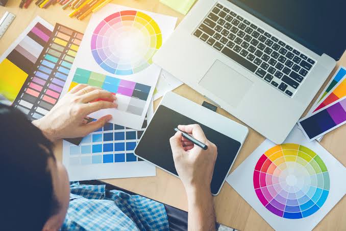
If a designer want to make an interesting design, he/she should consider about the right color choice for the design. Color is one of crucial part of a graphic design, because it can influence people’s perspective when they see the design.
When a graphic designer makes a logo without considering the right color combination, the logo will not attract audience or potential buyers. Even a brand or company message will be difficult to translated or convey when color choice of the logo is not considered carefully.
We will explain briefly why color choice of a design is very important, and how to choose the right color for your brand or company design.
Colors in a design has its main function to attract audience’s attention. The reason is because colors are the easiest visual item to be memorized by audience when they see something new.
Coloring aspect in a design also make things easier for branding purpose, so that it can be known widely. Without being able to choose the right color, a brand or company will be facing difficulties in attracting audience, moreover to convey brand values.

There are a lot of considerations in choosing the right colors for a design. Not only from the aesthetic point of view, but also from gender to cultural considerations.
A good graphic designer needs to anticipate cultural differences in choosing colors for graphic design; because each color might has different meanings between cultures. For example, in major countries the color white simbolizes holyness, meanwhile in some Eastern culture it represents mourn. Or the color red that often correlated with warning or danger, means joyfulness and celebration in other culture.
The point is, before choosing colors for a design, make sure to do a proper research so the design purpose to bring message to the audience or ideal customers is achieved.
How to Choose the Right Color for a Design
1. Specify brand identity
Before choosing colors for a graphic design, try to know further about the brand. Find out the audience target of the brand; whether it’s for male, female, young adults or even for kids. Is it a luxurious brand? Is it targeted for middle class or a more sophisticated target market?

When you know further about the brand, then you might find the brand identity. Thus, color choice for logo design or any other graphic design will be more easily done.
2. Acknowledging Trends
Design trends is always changing and growing every year. Of course we cannot change a brand’s specific design annually. Here, we need to find out what’s trending at the moment.

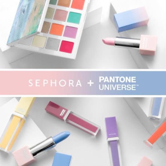
In color choice, we can find out what pantone palette is in for the current or upcoming year’s trend. Your designs will look up-to-date because its using the latest color palette trend. But you should consider if the trendy color suits the brand identity. If it’s not suitable, then using the original design is preferable in case of a logo design.
3. Find out the right color for the industry
Industry type also highly determines color choice in design. For example, a food and beverage brand needs to know what colors commonly used on the industry.

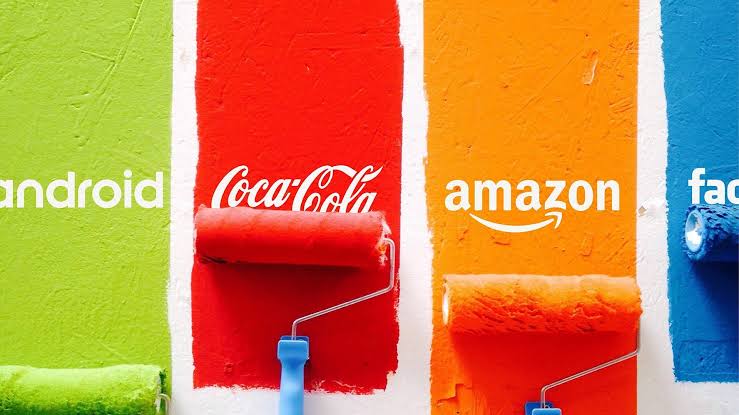
Usually an industry has their own trend to specific colors. For example, most of high-tech industry designs are using steel blue for one of the color palette; or food and beverage industry mostly using yellow, red and orange color palette.
If you want to be safe, you can try using commonly used colors in a particular industry. But we also need to remember that this is not the rule of a thumb, that we can always be creative as long as it suits the brand or company value and identity.
4. Understanding psychology of colors

Every colors has their own emotional influence to people. Here are some examples:
Blue
The color blue gives the feeling of trust, safety and relaxation to the audience. Blue is also related mostly with joyfulness and hospitality. That’s why a lot of brands using blue color on their logo, so that their customers can put some trust on the brand or company.
Black
The color black is also often chosen for a brand or company logo, because it symbolizes power, formality and stability. If you want to show a strong and steady brand value, you can choose black as the design’s main color.
Red
Red is one of the most frequently used colors in a brand or company graphic design. In food and beverage or retail industry, this color is very often used because of its bright color attracts audience easily. This color also gives certain impressions such as self esteem, courage and passionate.
Green
The color green is known to give relaxing effect to the audience. It represents natural environment with a lot of trees and plants. It mainly used by organic food and beverage brands. Green also gives the impression of harmonic, growth, fertility and peace.
Yellow
In a joyful design, the color yellow is often used. Yellow can give positive affirmations to the audience such as warmth, happiness, and hope.
Conclusions
Thus, colors in graphic design is proven to have big influence, because it can persuade audience’s preferences. Don’t skip color choice in your design process!


